Reimagining the Safe Shopping Journey
Experience Design · Chrome Extension · E-commerce
Trusti — Scam alerts for online shopping
Changing how online shoppers decide to pay, from a scam shop that looks real to a verified store one click away.
Role
UI/Motion Designer
Duration
Jan 2024 – Jun 2024
Scope
5 interviews · 2 rounds of usability testing · 3 touchpoints
Team
Product Manager · UX Designer · Visual Designer · UI/Motion Designer
One shopping trip, played twice.
Without Trusti, the shopper follows a shop with a too-good sale from its home page to Order Confirmed, and the only help left is a chat about getting the money back. With Trusti on, the same purchase stops at checkout: the page greys out, the alert lists its reasons with sources, and the shopper reports the site and moves to a safe shop.
Built from the final prototype’s screens. 19 seconds, no sound, loops.
01
Without Trusti. Darya.com, 40% off everything: the boots, the cart, checkout, Order Confirmed.
02
Help after the fact. The support chat gives the first three steps after a scam.
03
Rewind. The same purchase again, with Trusti switched on.
04
Stopped before paying. The page greys out and the alert says why the shop looks wrong.
05
Report, then shop somewhere safe. One click reports the site, and the suggestions lead to a verified store.
Scam shops no longer look like scams.
Payment fraud on shopping sites costs consumers more than $40 billion a year, and Millennials and Gen Z are the most likely to fall for it. The people we interviewed trusted a site that looked legitimate and a price that looked real.

What participants told us in the interviews.
Each existing tool covered only part of the problem.
We read 18 articles on online shopping fraud, interviewed 5 people who had been scammed, and compared 6 existing tools. Trusti brings the parts those tools cover into the moment of a purchase.
18
Articles
Desk research on shopping fraud
5
Interviews
People who had been scammed online
6
Tools compared
None built for e-commerce
01
Browser protection is not enough. 52.5% of cybercrime victims fell for phishing, although Google blocks 99.9% of phishing attempts.
02
The price and the site both looked right. Four of the five participants were taken in by a believable price, and four by a site that looked legitimate.
03
Being scammed changed how they shop. Four of the five felt anxious once they realised, and four trusted online shops less afterwards.
04
They wanted protection before paying. All five said so, and all five found recovering from a scam frustrating.

Cybercrime by type among 323,972 internet users, from desk research.
How might we help shoppers feel safe and confident when they pay?
Every participant had made the fraudulent purchase on a computer, so we designed a browser extension that is already open when a shop looks wrong. We set three principles for it.
01
Educate. Show why a site looks unsafe, so the shopper can spot the next one.
02
Keep them shopping. Offer a safe place to shop, so a warning does not end the visit.
03
Help them finish the purchase. The shopper came to buy something, and the safe option should still end in a purchase.

The two touchpoints we started from: an alert that says why, and safe places to shop instead.

Low-fidelity flows for a safe shop (top) and an unsafe one (bottom), the version we took into the first round of testing.
Testing — Round 1
The alert was too wordy, and people took it for an ad.
We tested the low-fidelity flows with participants shopping on realistic sites. Each finding below changed the design.

01 · Make it scannable
Every participant found the alert wordy. Each reason became one short line.

02 · Show the way out at once
Participants said they would leave a flagged site straight away, before reaching the alternatives behind Report. The alternatives moved onto the alert.

03 · Look serious
Three of the five participants thought the alert was an ad and scrolled past it. The page now greys out behind it, the way a site blocker does.

04 · Help after the worst case
Some participants did not know what to do after being scammed. A support chat now gives the first steps without leaving the browser.
Testing — Round 2
People wanted proof, and more choices.
The mid-fidelity version tested what low fidelity could not show: visual hierarchy, micro-interactions and the icons. In the chat, participants also wanted direct contacts, so the answers now include phone numbers and links.

01 · Show the evidence
Most participants wanted to know how a verdict was reached. Each reason now links to its sources.

02 · Help people choose
Unfamiliar shops were hard to judge. Suggestions now show a price range and say when they are ads.

03 · Offer more shops
Four suggestions were not always enough. Explore more brings up others.
One panel for the whole decision.
Everything is in one panel that opens from the toolbar icon: the verdict, the reasons with their sources, Report, safe alternatives with price and ad labels, and a Message tab for the support chat. On a safe shop, the same panel says why the shop can be trusted.

01 · At checkout
The alert lists the reasons with their sources and safe shops to go to instead. One click on Report flags the shop.

02 · After a scam
The chat opens with suggested questions and answers with three recovery steps, each with links.

03 · On a safe shop
The toolbar icon shows a green check, and the panel says why the shop can be trusted.
The same screens in order: from the alert to a safe shop, and from the alert to the support chat.
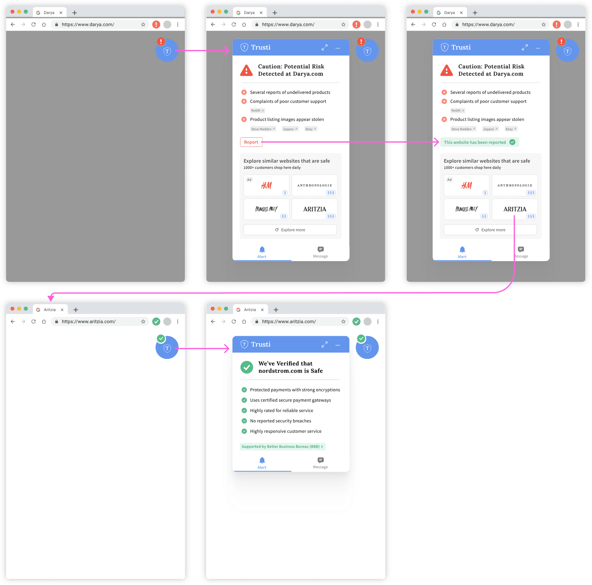
Scam detection to a safe shop: the alert, Report, the alternatives, and the verified store.

On-demand support: from the alert to the chat’s three recovery steps.
A panel inside someone else’s website has a few seconds to be believed.
I designed the interface and its style guide. The panel is about 320 px wide and sits on top of a shop that is trying hard to look trustworthy, so it needs a frame of its own: a blue header that always reads as Trusti, red only for risk and green only for safe.
Headings are set in Lora, and everything that has to be read fast in Source Sans Pro. I built the components (reason rows, source chips, shop cards, chat suggestions, toolbar badges) so two designers could keep the screens consistent.

Foundations: a blue primary, a neutral and text range, red and green kept for alerts, Lora for headings and Source Sans Pro for reading.

Components: chat suggestions in every state, the toolbar badges, tabs, Report, shop cards and the alternatives panel, with the icon set.

The logo and the panel’s specs: 22 px margins, an 8 px gutter, 12 px corners.
I added a mascot so the warning would not read like an antivirus pop-up.
Trusti interrupts people just before they pay, and it is also the voice in the chat after a scam. A character gives the toolbar, the alert and the chat one personality, and it can show a verdict before a word is read. The body is the logo’s shield, with ears from a watchdog.
At rest the ears wrap the shield into a 16 px ball, the toolbar icon. When a shop looks wrong they open: up for suspicious, out to the sides to stop, one ear pointing to a safe shop. A badge beside it shows the verdict in amber, red or green.
Five directions came first: a pixel shield, a price tag with a monocle, a pangolin, a watchdog and a computer mouse. The plain shield looked ordinary, the price tag did not connect to the logo, the pangolin was too busy, the dog too literal, and the mouse moved less clearly than the shield.

The directions in order, left to right, and the one that was kept.

The character kept: asleep, awake and stopping, what the ears do, and the sizes from the 16 px toolbar icon to 96 px.
What’s Next
Trusti did not ship. These are the numbers we would track if it did.
If Trusti were live, the measures that matter are how many people leave a flagged shop instead of paying, how many open a safe alternative, how long they read the reasons before deciding, and whether reported scams fall. A short survey after use would show whether people feel safer.
01
Reach shoppers on their phones. Small shops increasingly sell through social media, where people buy on their phones, and an extension does not reach them.
02
Decide whether the chat is needed. It helps people who ignored the alert and were scammed anyway. If the alerts work, it could instead flag risky patterns while people shop.
03
Test the mascot. The open question is whether people heed a warning more when a character gives it.
What I Learned
Three things I would do the same way again.
01
Cut anything that does not help the decision. People give the panel a few seconds, so every line on it had to help them decide.
02
Follow the shopper past the warning. That is where the alternatives and the chat came from.
03
Test the design twice. Round one fixed how the alert reads; round two added the proof and the choices people asked for.
© 2026 Sam Wang